


How can brand elements be incorporated to enhance product recognition during the design phase of cowhide boxes?
Release Time : 2026-03-09
In the design phase of a cowhide box, integrating brand elements is crucial for enhancing product recognition and conveying brand value. Due to its natural texture, eco-friendly attributes, and versatility, the cowhide box has become a popular choice for brand packaging. However, organically combining brand characteristics with the properties of kraft paper through design requires comprehensive consideration from multiple dimensions, including color, graphics, text, structure, and interactive experience, to create a unique and memorable visual language.
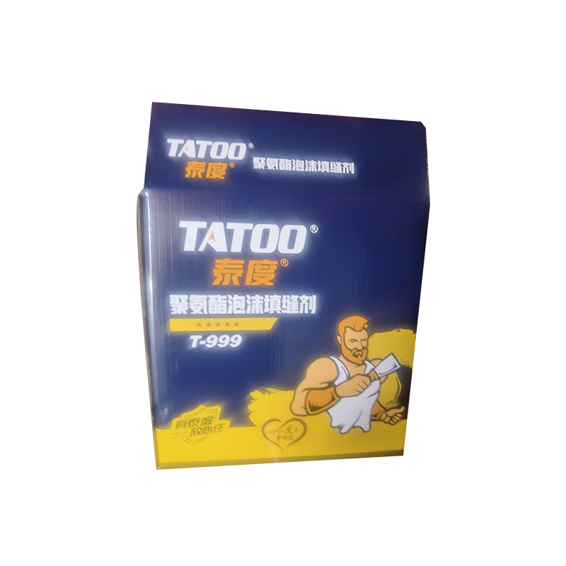
Color is the most direct way to integrate brand elements into cowhide box design. The brownish-yellow hue of kraft paper gives the packaging a natural and rustic base. Brands can enhance visual impact through localized embellishments or contrasting color combinations. For example, food brands can use brightly colored labels that match their brand image in key areas of the box. For instance, health foods might use green, and organic brands might use earth tones, preserving the natural feel of the kraft paper while highlighting the brand identity through color contrast. At the same time, avoid large areas of bright color coverage, as this can diminish the textural advantages of kraft paper. Instead, use small, precise areas of color, such as brand-standard color blocks, icons, or lines, to inject brand vitality into a natural tone.
Graphic elements are a crucial vehicle for conveying brand stories and culture. Cowhide Box's graphic design can incorporate the brand's core values, employing abstract symbols, illustrations, or photographic images. For example, a craft brand could print hand-drawn patterns or tool designs on the box surface to reinforce its "craftsmanship" positioning; a fashion brand could create a modern feel through minimalist lines or geometric shapes. The graphic design should complement the texture of the kraft paper to avoid overly complex patterns that could cause visual clutter. For instance, using monochrome lines to outline the brand's iconic elements, or utilizing the rough texture of kraft paper as a background, and enhancing the three-dimensionality of the graphics through embossing, allows the brand information to be conveyed both tactilely and visually.
Typography is a core element of brand communication. Cowhide Box's typography design must balance readability with brand tone. Key content such as the brand name and product information should use clear and legible fonts; sans-serif fonts can enhance a modern feel, while handwritten fonts can convey warmth. Simultaneously, adjusting font size, letter spacing, and line spacing creates a well-defined layout structure. For example, the brand name can be prominently displayed in a larger font size at the center of the box, while product descriptions or ingredient lists can be arranged in smaller font on the sides or bottom, ensuring information integrity without being overwhelming. Furthermore, the text color can create a subtle contrast with the kraft paper background, such as a dark brown box with white or light gray text, enhancing readability.
Structural innovation is key to cowhide box design differentiation. Brands can enhance the sense of occasion and interactivity of packaging through unique box designs. For example, using drawer-style, flip-top, or magnetic structures improves the opening experience; or designing foldable, reusable boxes conveys an environmentally conscious message. Structural innovation must be closely integrated with brand positioning. For instance, high-end brands can enhance luxury through sophisticated clasp designs or internal lining dividers; fast-moving consumer goods brands can simplify the structure, reducing costs and improving production efficiency. In addition, details in the structure, such as rounded corners and edge creases, can reflect the brand's pursuit of quality.
The combined application of materials and processes can further enhance cowhide box brand recognition. Kraft paper, with its inherent malleability, can be enhanced with techniques such as hot stamping, UV printing, die-cutting, and embossing to improve both visual and tactile appeal. For example, hot stamping can be used on brand logos or key graphics to enhance gloss and texture; or die-cutting can be used to create brand designs on the box surface, resulting in light and shadow effects. The choice of techniques should match the brand's image; for instance, vintage brands can use distressed finishes or monochrome printing, while modern brands can experiment with gradient printing or metallic coatings. At the same time, it's crucial to avoid overusing techniques, which could increase costs or diminish environmental impact, and to find a balance between effect and cost.
Integrating the brand story is a key means of deepening emotional connection in cowhide box design. Through text on the box, interior lining, or additional cards, the brand's origins, product philosophy, or usage scenarios can be explained, enhancing consumer identification with the brand. For example, food brands can include stories about the origins of ingredients or recipe cards inside the box; beauty brands can showcase their inspiration through illustrations on the box. The story should be concise and engaging, avoiding lengthy text and instead conveying the core message through a combination of text and images. Furthermore, the repurposing of packaging, such as transforming the box into a storage container or decorative item, can extend the interaction cycle between the brand and consumers.
Take a coffee brand as an example. Its Cowhide Box design uses the brand's signature green as the main color, highlighting the brand name with partial gold foil stamping. The box surface features a simple line drawing of a coffee cup, conveying the brand's philosophy of "nature and quality." The box uses a flip-top structure, with internal compartments to ensure the safe transport of coffee beans, and includes a card telling the origin story, enhancing consumer trust in the brand. This design retains the natural texture of kraft paper while creating a unique brand identity through the comprehensive use of color, graphics, and structure. In the future, as consumers pursue environmental protection and personalization, Cowhide Box design will place greater emphasis on the deep integration and innovative expression of brand elements, driving the upgrade of packaging from a functional carrier to a medium for brand experience.